The Case for Bottom Navigation Bars
Utilizing familiar design patterns for agentic interfaces
Set Aside the Sidebars
Arc has popularized vertical tabs and OpenAI has paved the way for agentic interfaces to proudly embrace the sidebar. Vertical tabs make sense. Sidebars do not.
Every AI application that wants to flex how agentic it is somehow falls into homogeneity: a sidebar with a ton of threads to the left, and the chat surface as the main content of the screen. I’ll also add the heavy reliance on Shadcn for sidebars on websites.
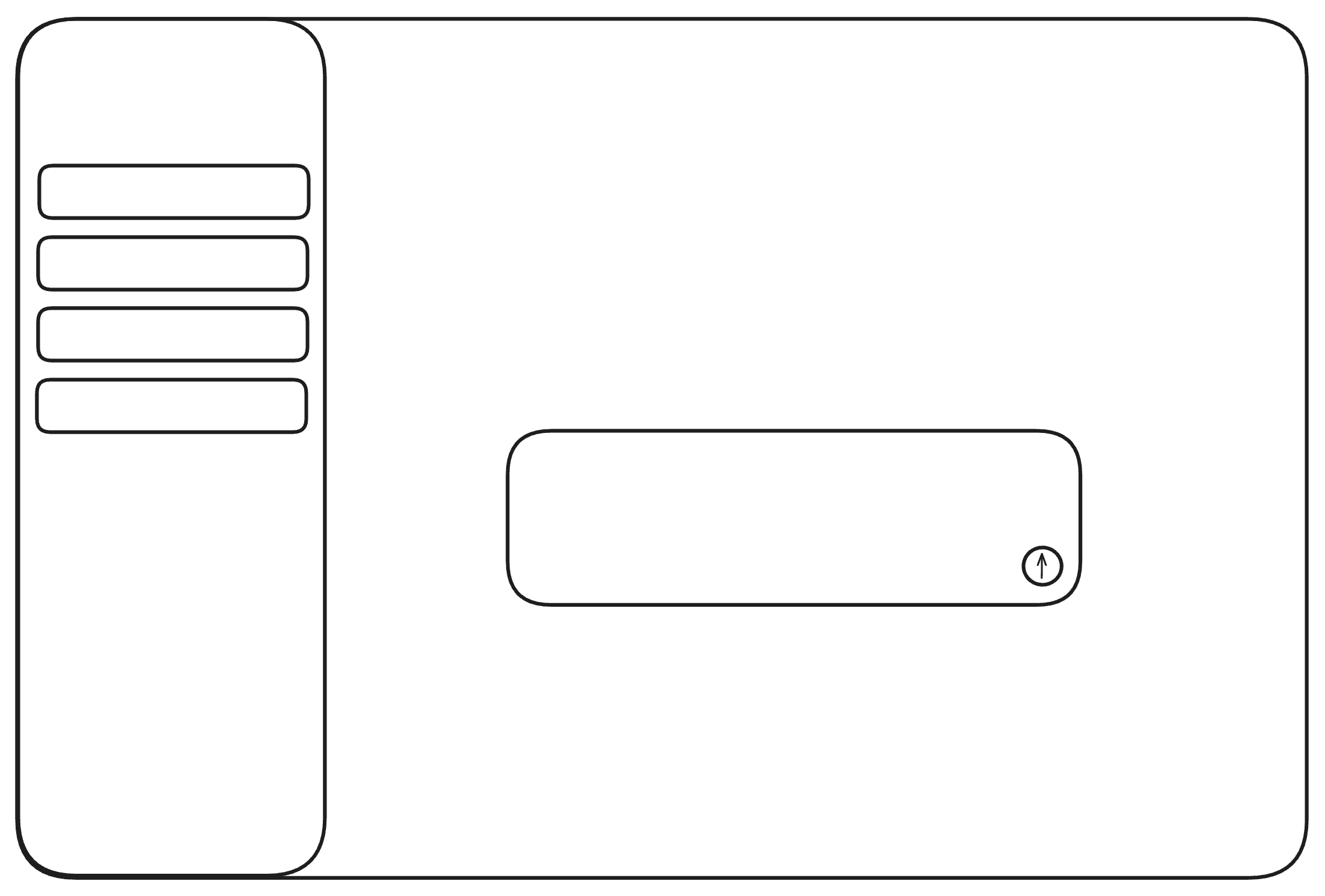
Look familiar?
Well, of course it does! It’s ChatGPT…no, wait it’s Cursor…Linear? Claude? Antigravity? I’m not sure.
Whatever the case, this is a highly impractical approach to agentic interfaces. Imagine this is the future and your AI companion is just an endless list of threads that eventually get abandoned. It gets overwhelming, too many things would be begging for your attention, especially with agents working in parallel.
There needs to be a new approach towards the surface that agents live in.
Defining the Criteria
I’m going to propose a few points of what I believe should be required for an optimal design:
- Familiarity: the design pattern should not attempt to revolutionize design entirely. Novelty can only go so far, and we are creatures of habit. It should be a design that has proven to be practical, and can easily be modified to fit the nature of agents.
- Focused: each screen should exist with intent. Avoid cluttered designs where multiple elements are crying for your attention.
- Maximized screen space: The interface should grant you the ability to maximize the available screen space. It should not interfere with the screen real estate.
- Adaptive to multiple platforms: The design must be able to exist on all types of platform relevant to working with agents.
The Solution
As you may have guessed from the title, the solution is clear and simple: bottom navigation bars.
The standard navigation that exists on almost every device you use: iOS, macOS, and Android with their docks, Windows with the taskbar, and Linux with variations of both.
These bars fulfill the criteria that I have detailed, largely because I made the criteria already having these in mind, but hear me out.
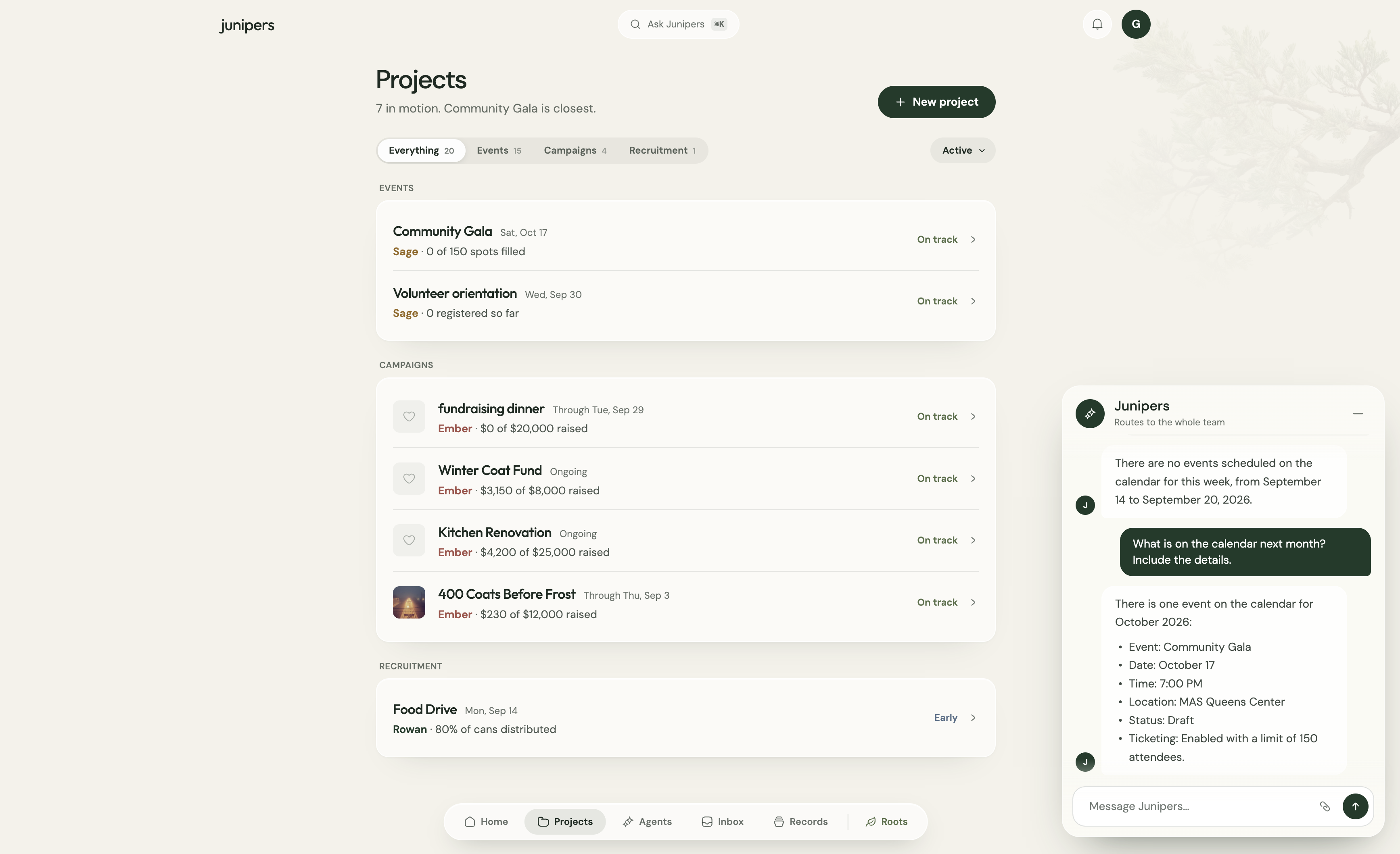
Did you notice that this website uses a bottom nav bar? I am able to maximize the space I have on the screen without the nav bar interfering with anything that I do.
Why do bottom nav bars work?
The pattern is familiar and already works: the aforementioned operating systems as well as the standard design for mobile apps take this approach. Each screen serves a core function. You have a lot of space to work with.
Where do agents fit here?
There doesn’t need to be a singular answer here. You now have the flexibility to design your agents’ surface exactly how you wish. Abandoning the sidebar relieves you of much needed horizontal space that was otherwise left neglected. Or, you could just have empty space!
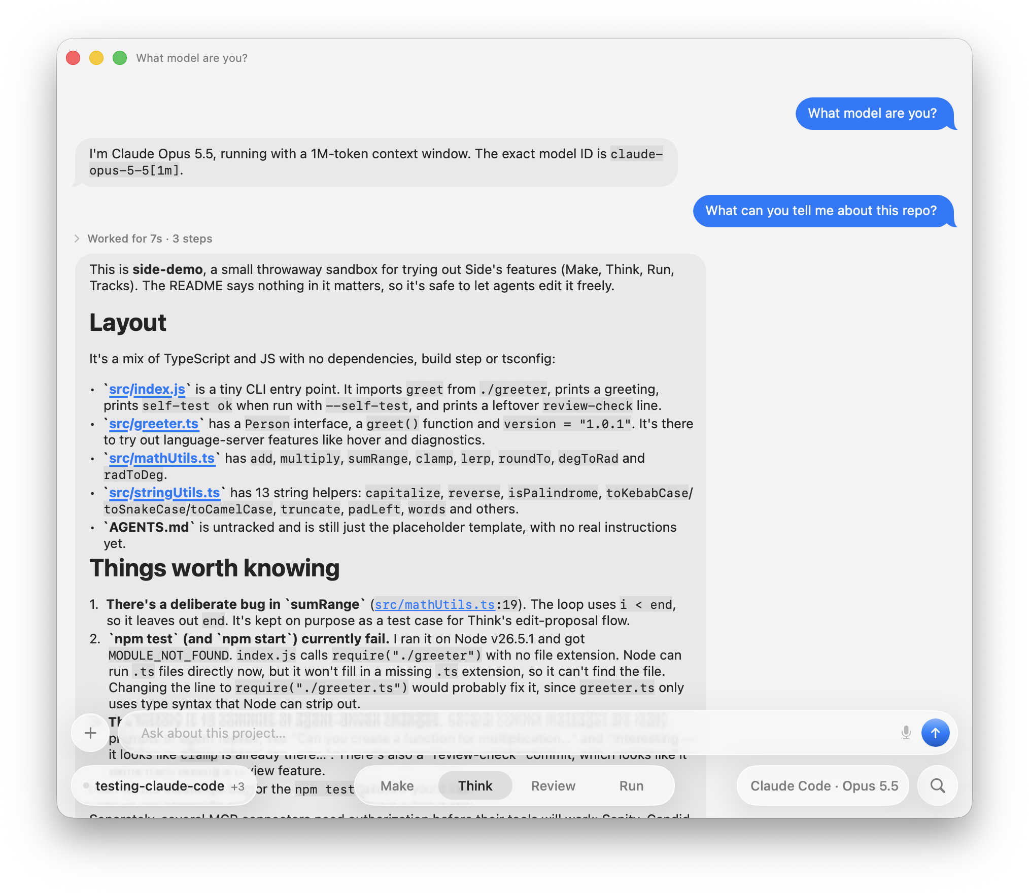
I’ve devised two approaches for my own use cases (with Junipers and Side):
- Standard chat interface, but it sits as one tab in the nav bar: you only access one thread at a time, so it is as if you are just talking to someone on iMessage.
- Chat bubbles: bubbles persist throughout and you can visibly see agents working through them. This is similar to how Messenger chats appeared on Facebook’s website.
Closing Thoughts
It’s pretty evident that the validity of bottom nav bars largely hinges on familiarity. I am simply applying the chat interfaces that have worked pre-AI and trying to fit agents in there. Companies that are utilizing iMessage agents seem to understand that well.
I don’t expect anyone to adopt bottom nav bars anytime soon, simply because it is not popular enough to warrant mass adoption in the AI sphere.
Cursor Projects are an admission that the sidebar design needs to change. A singular orchestrator agent sounds far more focused and easier to work with than having to manage multiple threads with agents working in parallel.
Of course, my opinion is just that. I could very easily be wrong, and there may exist some radical design breakthrough that will have all our lovely friends at SF and design X/Twitter salivating.
Please end the sidebars.